ShopHero: Redesigning Grocery for 100+ Retailers
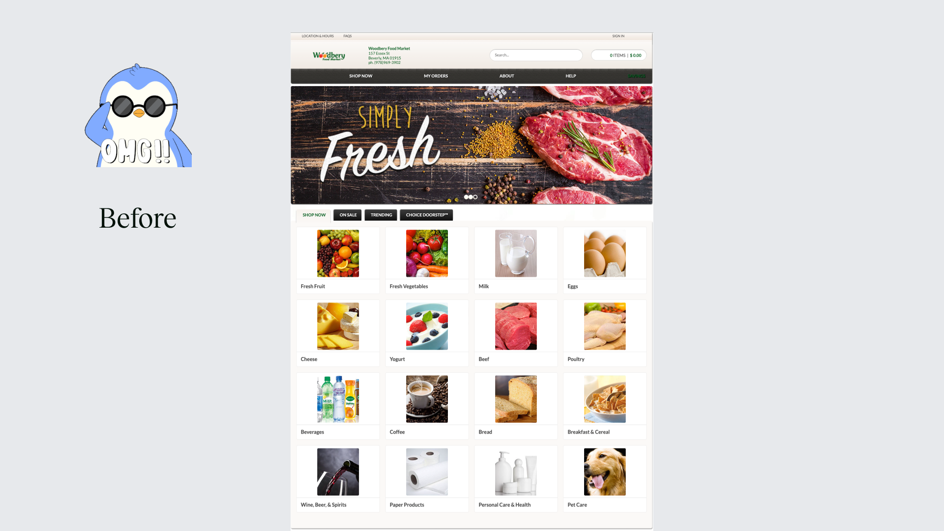
ShopHero is a white-label grocery platform powering the customer-facing websites and apps of 100+ retailers. For the past several years I led the end-to-end redesign of its core shopping experiences, first the website, then the mobile app, so that everyday shoppers could activate faster, convert more reliably, and return week after week.
The work has been praised for turning a fragmented, high-friction grocery flow into something that feels modern, habitual, and quietly powerful. Seeing retailers adopt it and watching first-order completion and repeat usage climb prompted me to write down the essence behind the redesign.
This is not a pixel-by-pixel tutorial. It is about how we made a complex multi-tenant grocery system feel welcoming, efficient, and scalable.
Role: Senior Product Designer (end-to-end: research, UX/UI, design system, usability testing, and handoff across website and mobile app).
Team: PM, designer, principal engineer, two front-end engineers.
What makes ShopHero, ShopHero
The redesign naturally crystallized three guiding principles: clarity, habit, and scalability.
Clarity removes friction so shoppers can complete an order without second-guessing. Habit supports the weekly, repeat nature of grocery shopping so the platform becomes part of routine rather than a one-off chore. Scalability lets every retailer brand the experience as their own while sharing a single, maintainable codebase and design system.
These principles respect the shopper's time, the retailer's brand, and ShopHero's ability to grow.
Clarity through progressive disclosure and transparency
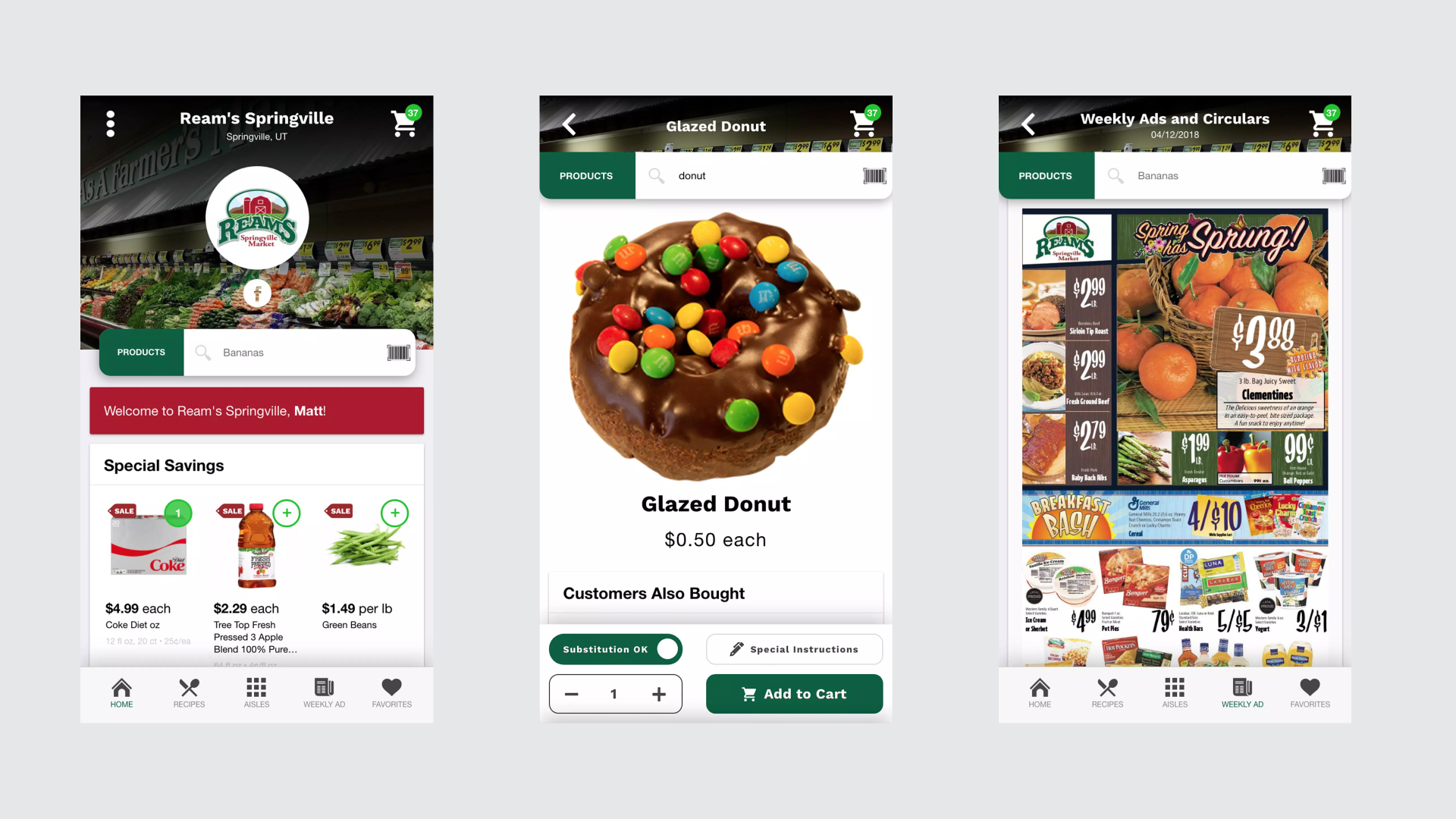
Legacy flows presented every option, fee, and substitution rule at once. Cart abandonment sat at 42% on the website; mobile felt equally fragmented and touch-unfriendly. Over-categorisation, weak unit pricing, hidden fees, and complex delivery-slot selection were the main culprits.
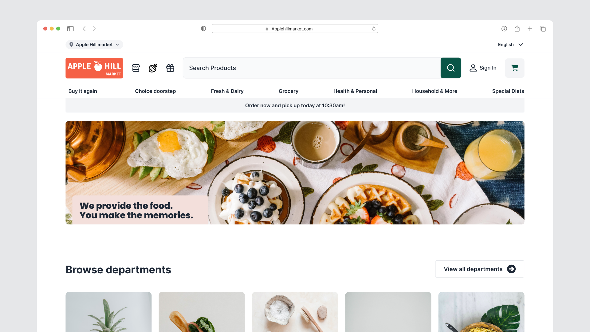
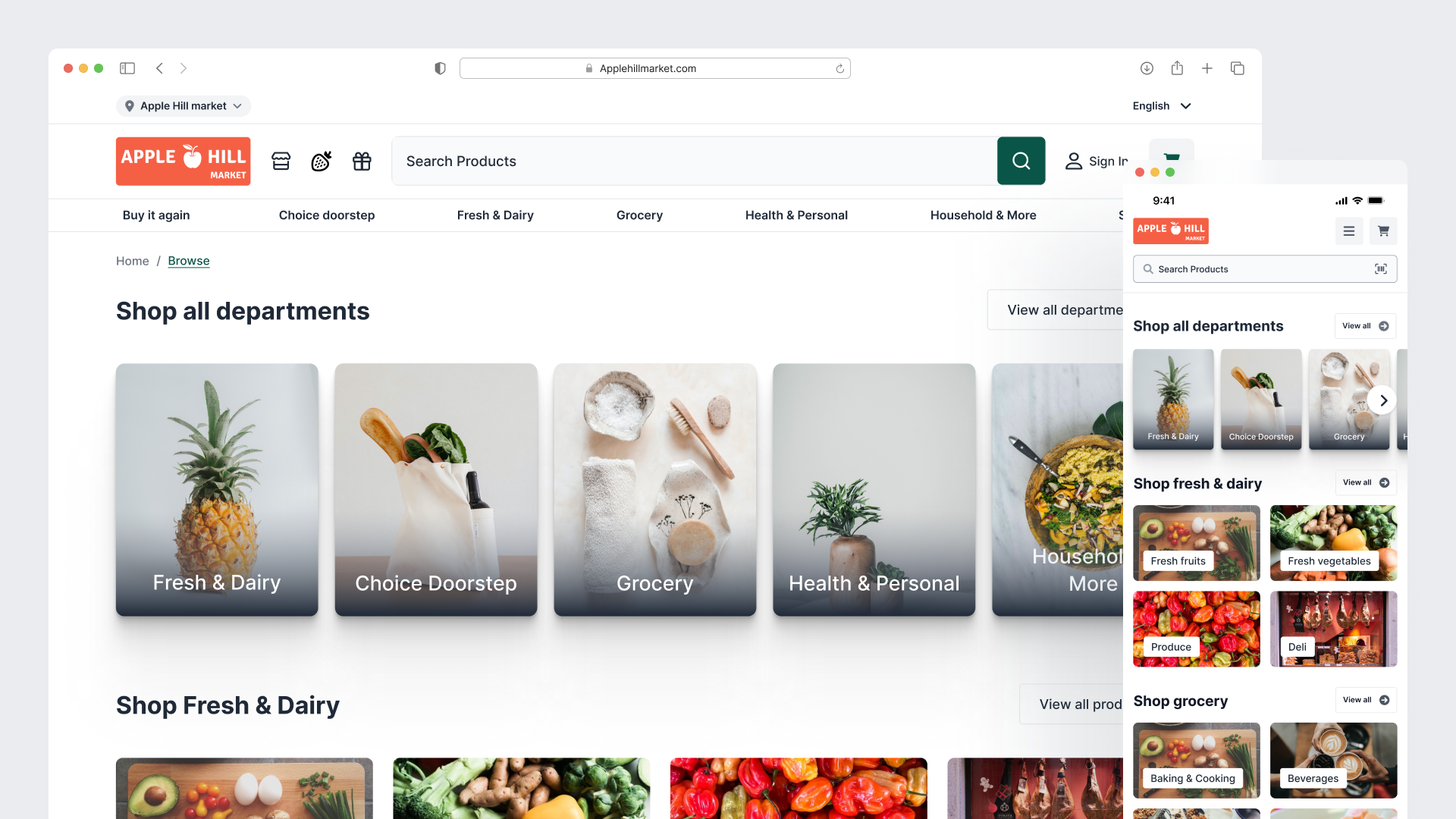
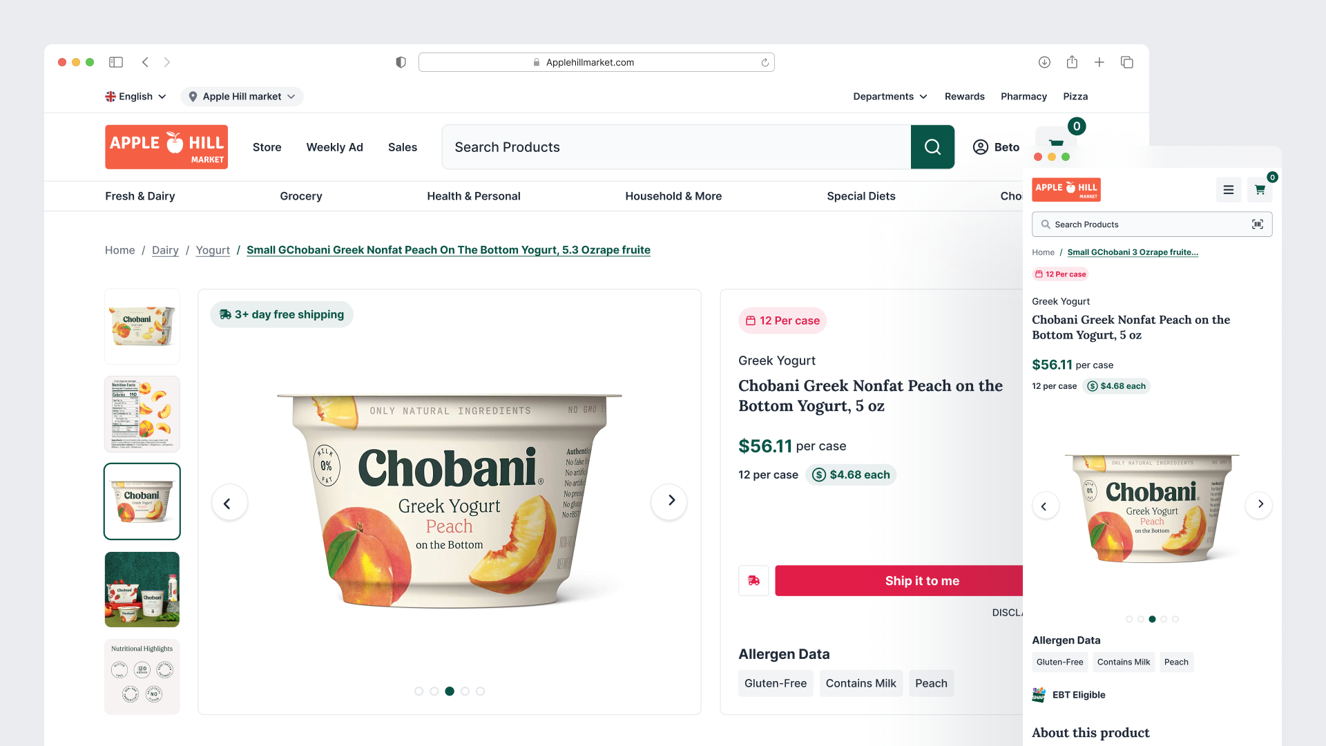
We rebuilt the hero journey (Homepage, Search/Category, Product Detail, Cart, Checkout) around progressive disclosure:
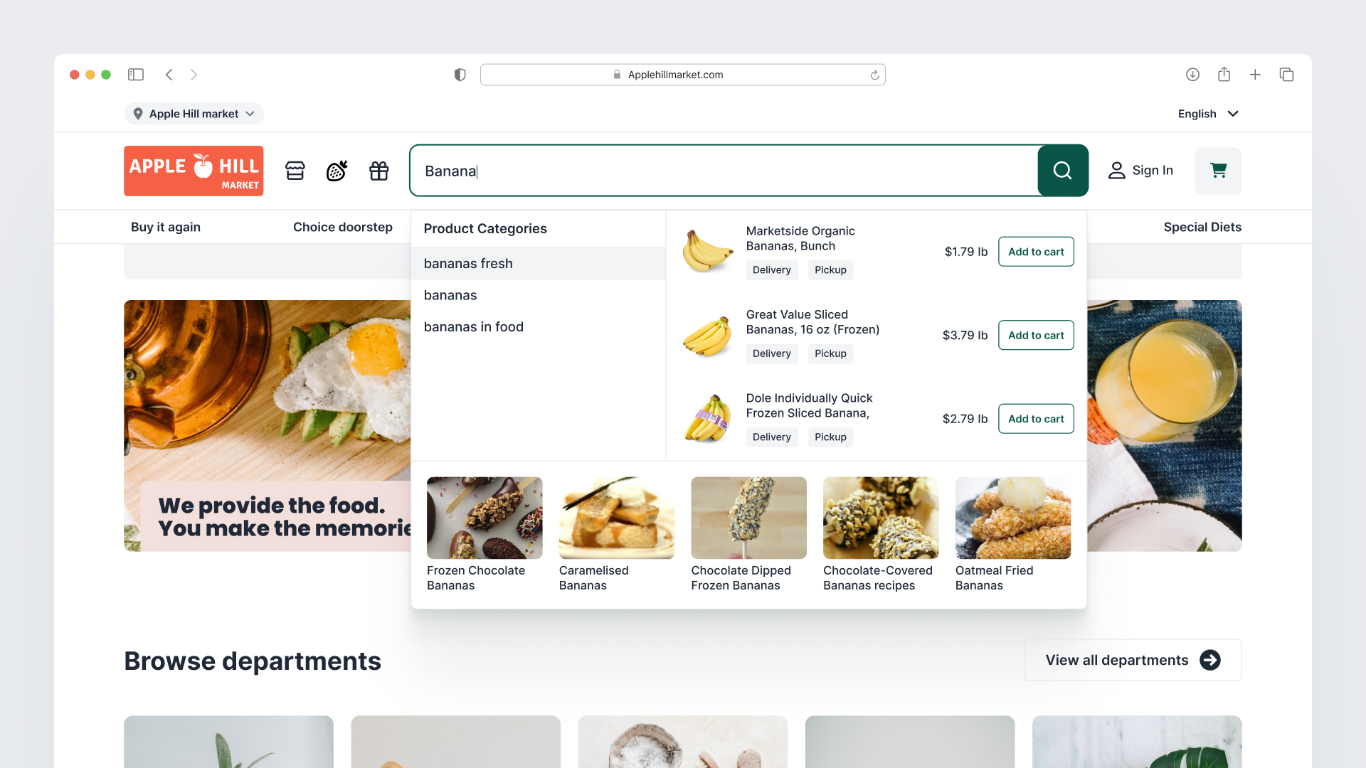
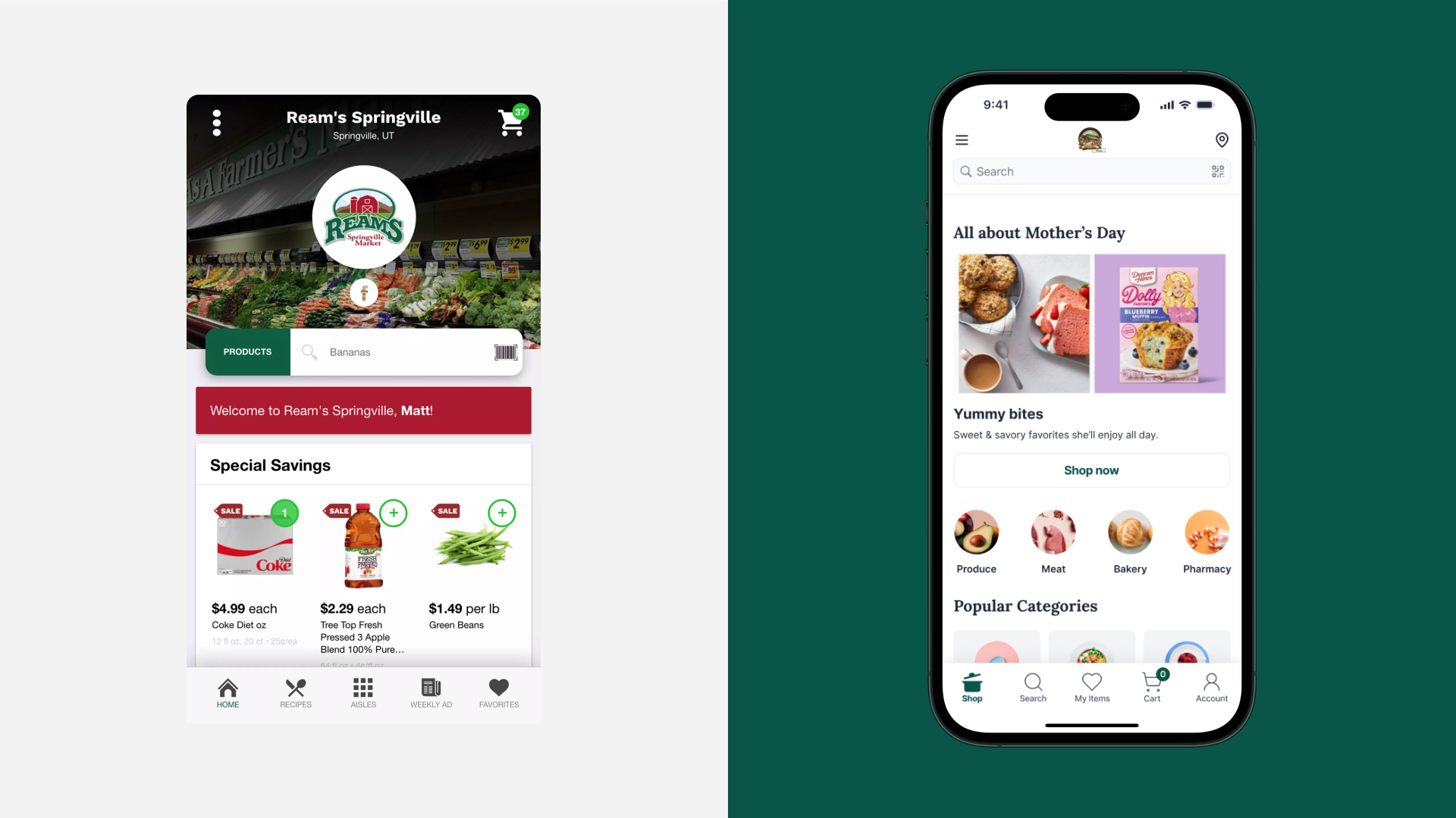
- Homepage opens with a zip/store selector, personalized past orders, and aisle-style category tiles so shoppers enter the experience oriented.
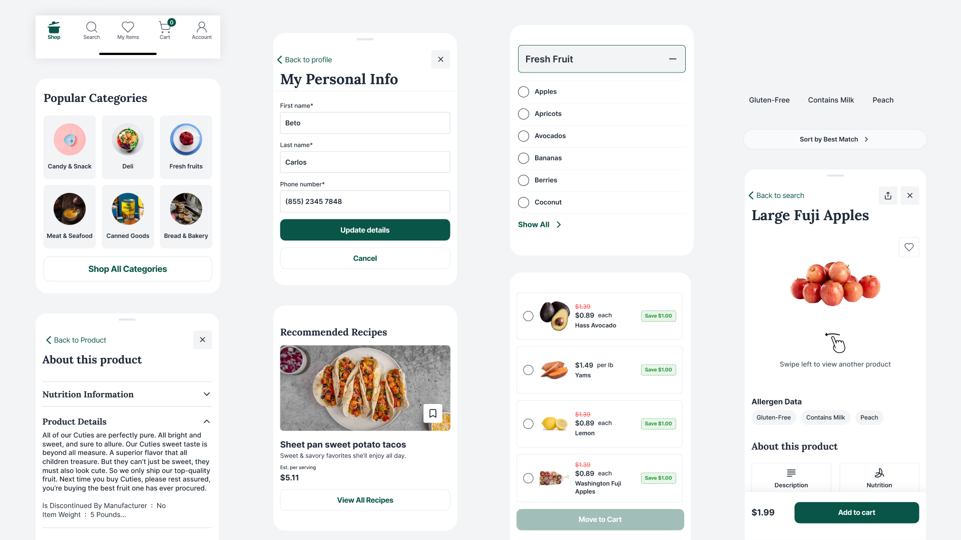
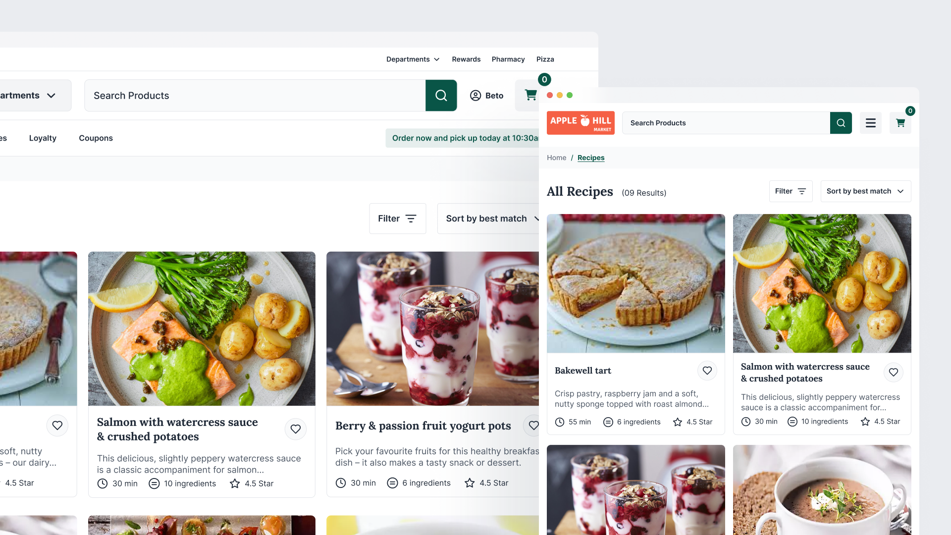
- Category and search results surface faceted filters with live match counts, unit pricing, and dietary tags. Infinite scroll and clear applied-filter chips keep comparison effortless.
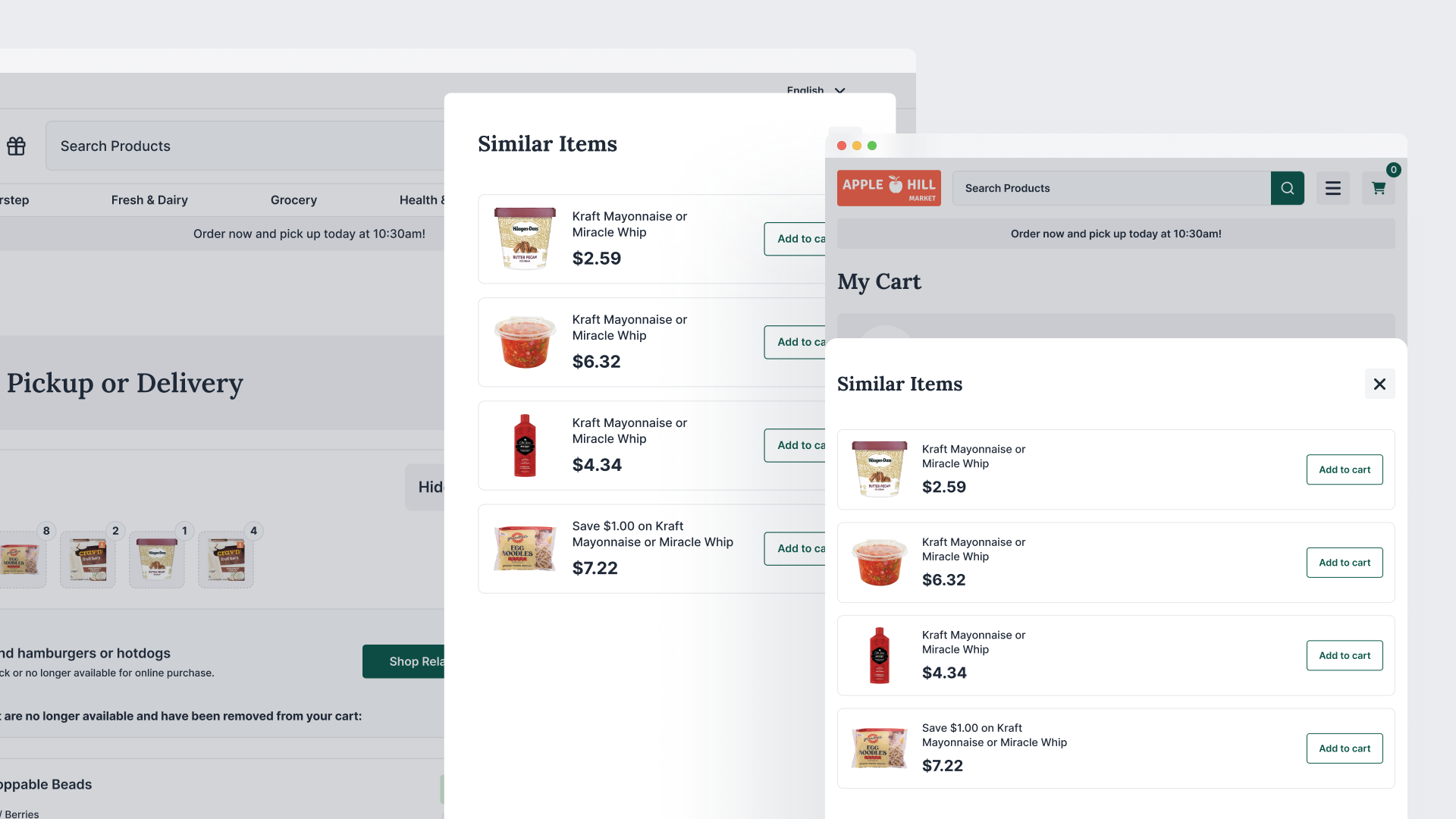
- Product pages lead with multiple images, nutritional facts, allergens, unit pricing, and contextual substitution suggestions plus "frequently bought with."
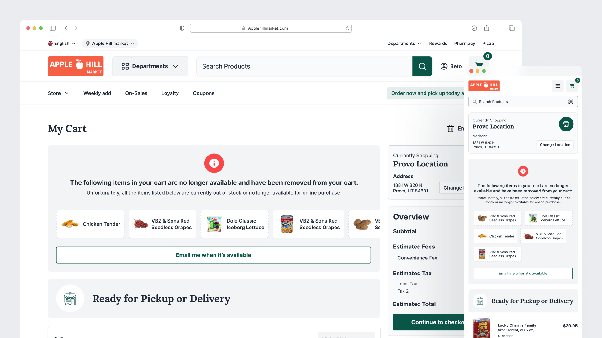
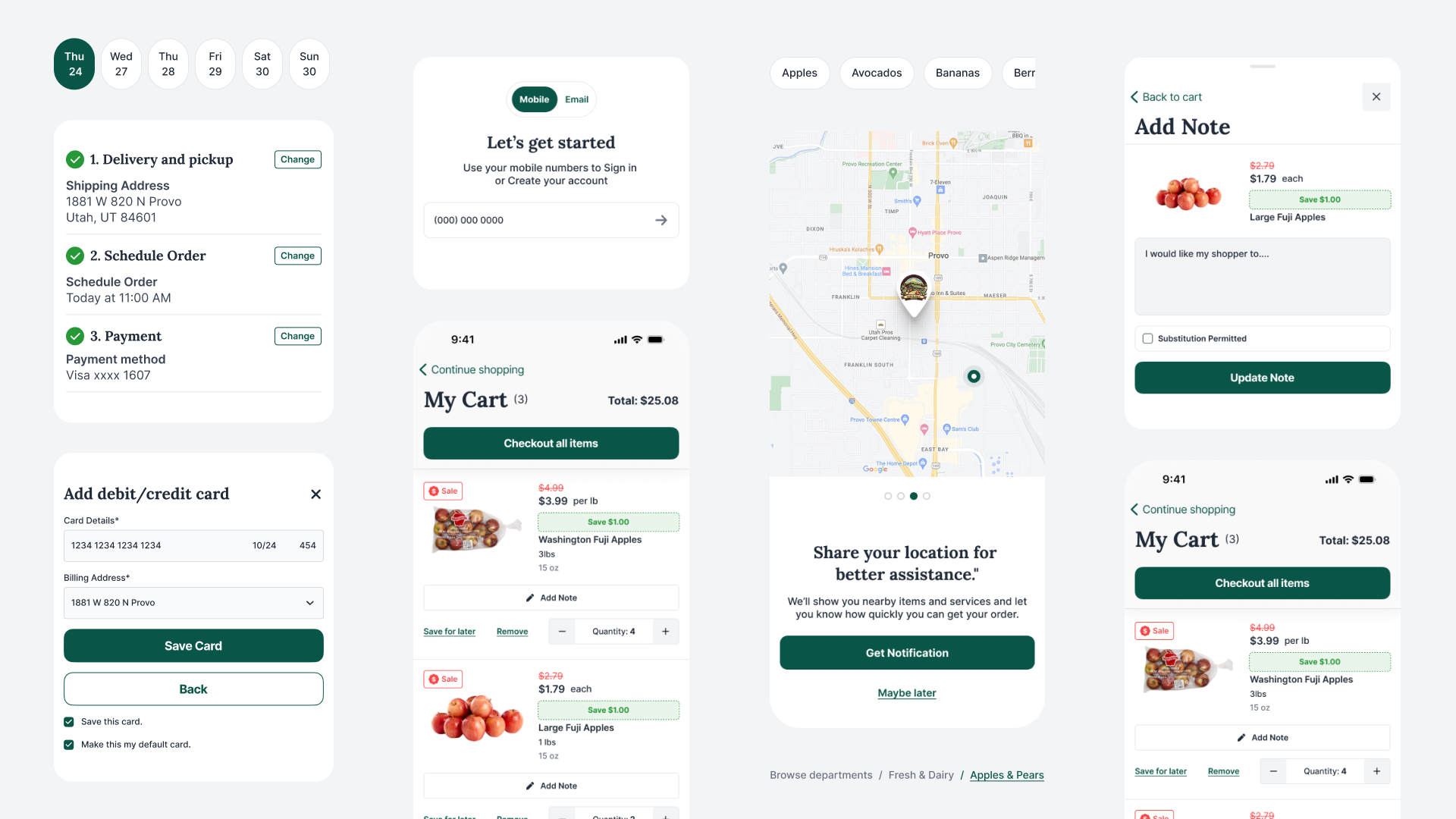
- Cart gathers substitutions at the cart level rather than forcing per-item decisions, shows fees early, and offers "Save for Later."
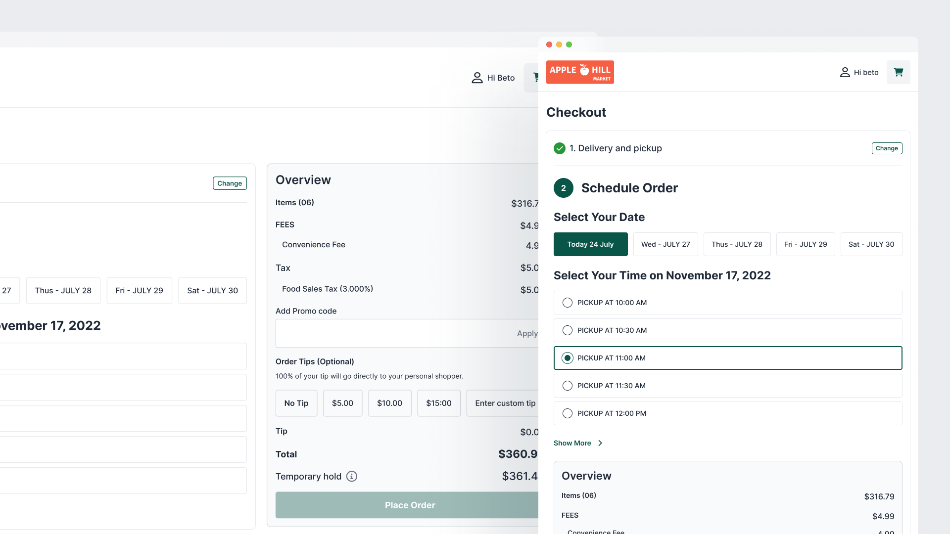
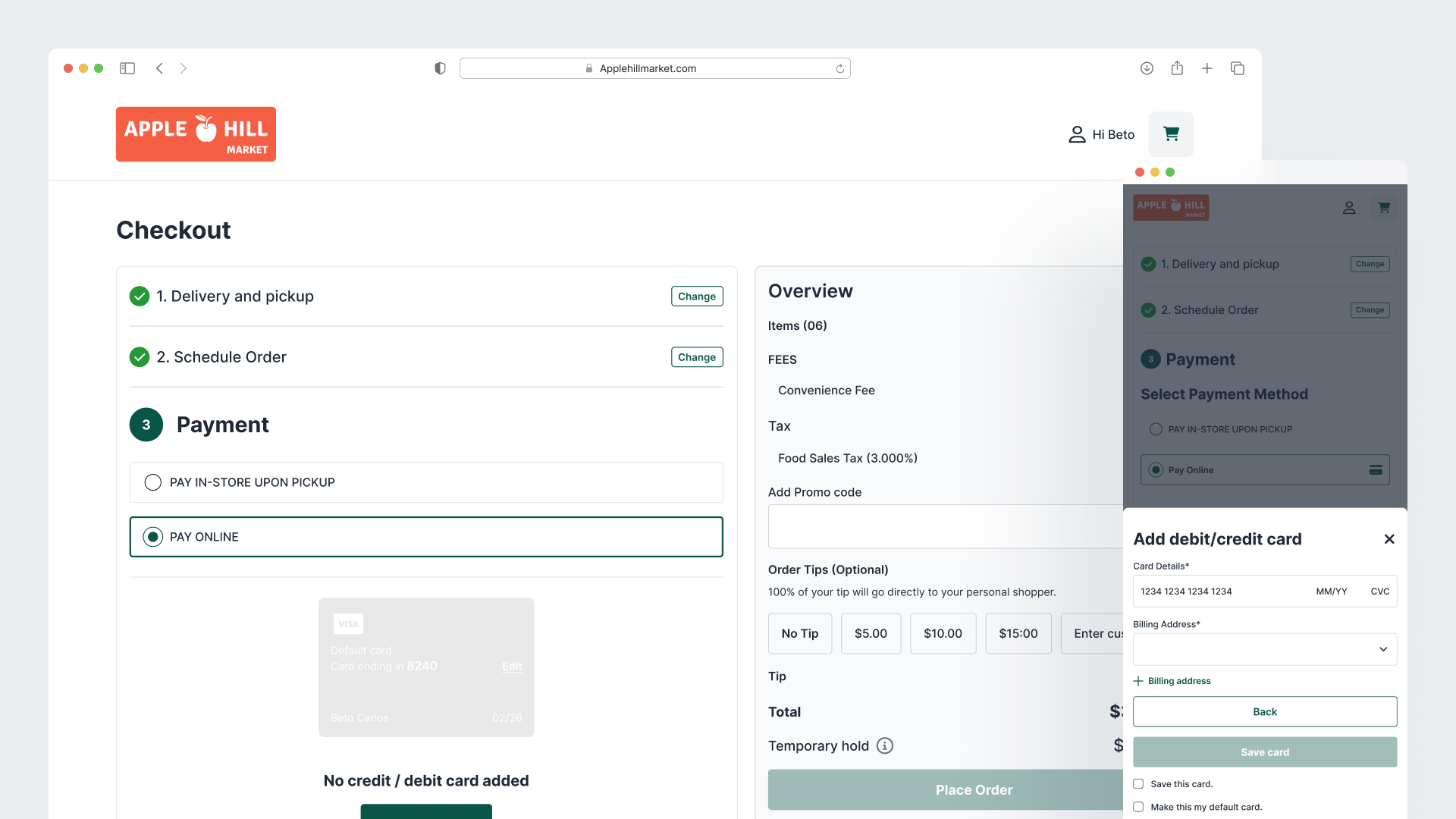
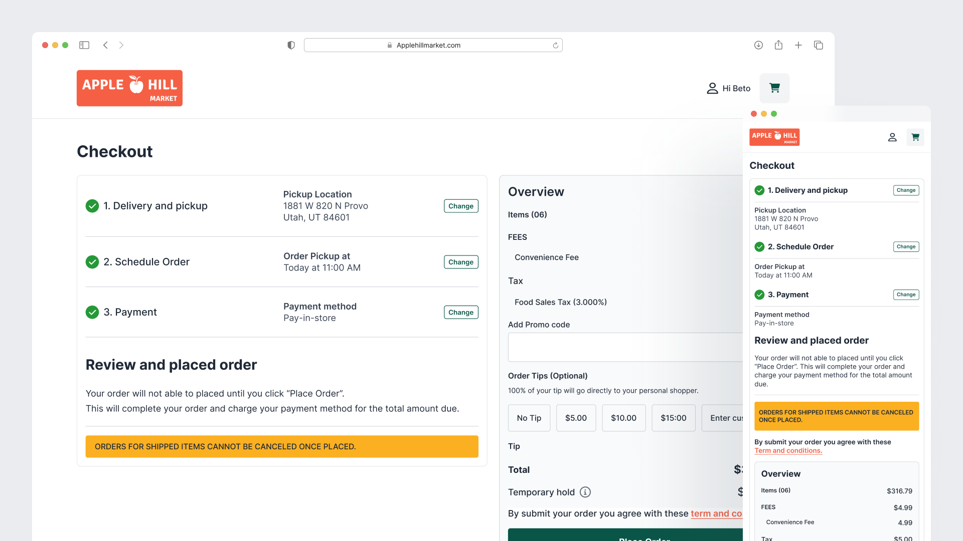
- Checkout collapses to three minimized steps: visual slot picker with transparent fees, order review with substitutions, and payment with collapsed coupon field and clear load indicators.
Every decision was grounded in Baymard research and validated with 5 to 8 usability sessions plus A/B tests. The result was a 31% drop in checkout abandonment and a 24% lift in overall conversion on the website; mobile cart abandonment fell 27%.
Habit through lists, reordering, and persistent context
Grocery is not a discovery-driven category like fashion. It is high-frequency and list-driven. The old experience under-supported saved lists, past orders, and quick reordering.
We elevated these surfaces:
- Persistent mini-cart and global substitution preferences travel with the shopper.
- Homepage and mobile home feed surface personalized past orders and quick-list entry points.
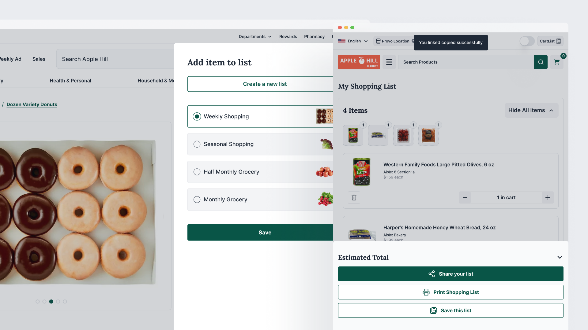
- Dedicated "My Lists & Reorder" flows (especially strong on mobile with bottom-tab navigation) make weekly shopping a one- or two-tap action.
- After order confirmation, reordering options are immediate.
Weekly reordering task success rose 45% on the website; mobile repeat usage (weekly active shoppers) climbed 41%. First-order completion moved from 41% to 57% on web (+38%) and +29% on first-session mobile orders.
Scalability through a single design system
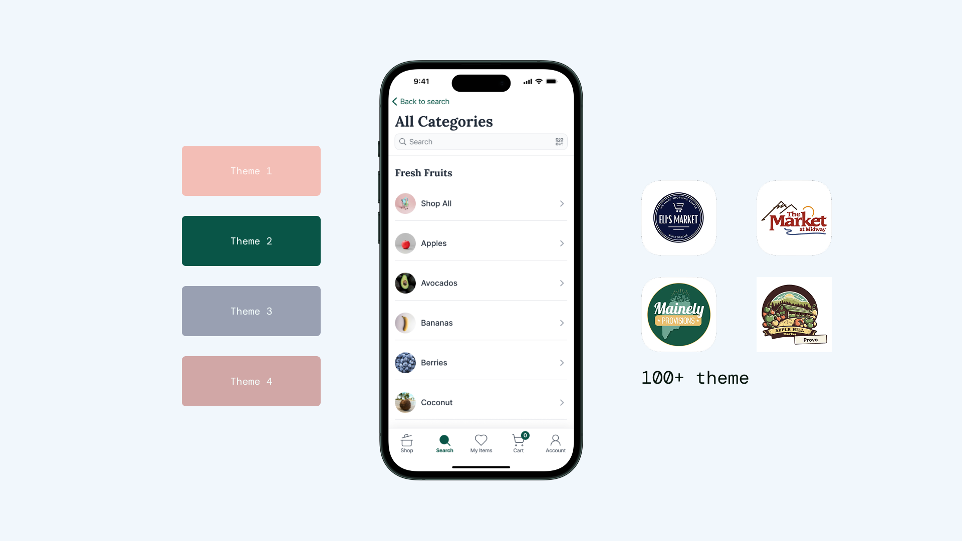
Supporting 100+ white-labeled stores previously meant fragmented codebases and inconsistent experiences. We built one responsive, desktop-first system with excellent mobile and tablet hand-off, fully themable for each retailer.
Trays, cards, filters, slot pickers, and substitution controls all live in a shared component library. Onboarding, store selector, loyalty integration, and branding tokens adapt per client without breaking the underlying patterns. The same system powers both the website (launched in six months) and the mobile app (1.5-year horizon), dramatically reducing overhead and accelerating retailer onboarding.

Impact
Website
- First-order completion +38%
- Checkout abandonment -31%
- Overall conversion +24%
- Weekly reordering success +45%
Mobile
- First-session order completion +29%
- Cart abandonment -27%
- Repeat usage +41%
Business
- 27 new retailer clients in six months
- Existing clients reported 18% higher shopper retention
- Platform subscription revenue +~22% YoY
- Mobile-attributed revenue for clients rose 35%; churn fell 19%
- Larger enterprise deals became easier to close because the platform was now a demonstrably stronger sales tool
Learnings
Baymard's grocery and mobile research accelerated every major decision and gave the small team defensible rationale. Habitual, high-frequency shopping rewards investment in lists, reordering, and fee transparency far more than flashy one-off features.
Checkout remains the highest-leverage surface; simplicity and early transparency win. A flexible design system is not a nice-to-have. It is the mechanism that turns product design into recurring revenue and faster client activation.
Next, we want deeper longitudinal testing with real weekly shoppers and privacy-respecting personalization (smart lists, AI-assisted substitutions) layered on the same foundation.
ShopHero is now the platform that lets independent and regional grocers compete with national players on experience while keeping their own brand front and center. That is the value we set out to create.
Masudur Rahman