UIGeek: A Structure for Native iOS App Development
I'm excited to introduce UIGeek, a structured approach and toolkit for building native iOS apps. It started as the rough prototype I wrote about earlier, and it's now a proper framework that anyone can use.
The best way to explain what it does is to show you. Every screen, transition, and interaction in this case study was built with UIGeek. In fact, so was the entire sample app and its supporting documentation, from the navigation architecture and shared components to every polished demo. I'd describe what I wanted, watch what the structure produced, identify the parts that still felt off, and feed the refinements back in. UIGeek helped build UIGeek.
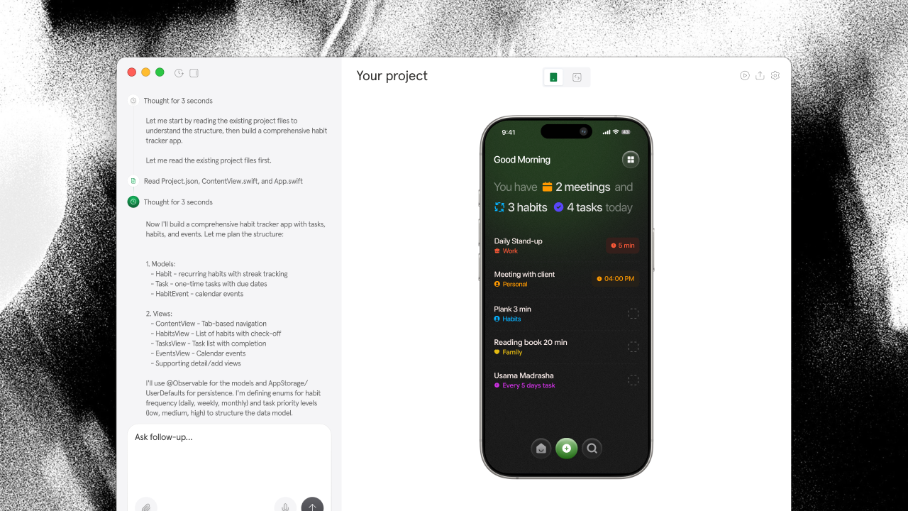
What follows is a tour of UIGeek's core pieces. Every demo was made with the feature it's showing. Yes, it's very meta.
Why native iOS feels hard
Building a native iOS app is so hard. You juggle UIKit or SwiftUI, Auto Layout or the new layout system, state management, navigation stacks, accessibility, Dark Mode, Dynamic Type, device-specific quirks, App Store requirements, and the constant feeling that something is one constraint away from breaking. That's why we built the UIGeek app development structure: a deliberate set of conventions, reusable primitives, and feedback loops that remove the friction without sacrificing the polish of true native code.
The loop looked like this: the structure generates a solid starting screen or flow. I run it on device or simulator, interact with it a few times. Something feels off. Maybe the spacing doesn't match Human Interface Guidelines, a transition is too abrupt, or a list doesn't respect safe areas properly. I note the issue against the exact component or layout rule, feed it back, and the structure adjusts. I check again. Still not quite right. Another pass.
This went on for hours. Dozens of iterations per screen. Hundreds across the entire sample app and docs.
Text and content refinement
The simplest case is copy and labels. You see a string that's too long for the button, or a title that doesn't match the system style. You select it, note the fix, and the structure updates the localized string and styling in one go. I cleaned up dozens of copy and Dynamic Type issues this way.
Select text or labels to annotate content, localization, or typography problems.
Component and view targeting
For everything else, you point at the view. UIGeek captures enough context (view hierarchy, modifiers, constraints or layout priorities, trait collections) for the next iteration to land precisely. Most of the screens you're imagining were refined this way: identify, note, iterate.
Tap any view or control to add structured feedback.
Multi-view and layout selection
Sometimes you need to adjust several related elements at once. I used this constantly when aligning navigation items, list cells, or toolbar buttons that all needed the same treatment.
Select multiple views to apply consistent spacing, styling, or behavior changes.
Region and empty-space feedback
You can also target empty regions. I used this for layout feedback, pointing at gaps that felt too tight, or areas where a secondary action should appear without breaking the visual hierarchy.
Drag to select any region, including empty space, for layout notes.
Animation and state freeze
SwiftUI and UIKit animations are the trickiest. The exact intermediate state you want to improve might only exist for a fraction of a second. The structure's inspection tools let you pause or scrub so you can note the precise timing, spring parameters, or matchedGeometry effect that needs work.
Freeze or scrub animations to annotate specific frames and transitions.
What the feedback captures
When you target a view, the output includes its identity (type, accessibility identifier, or key path), position in the hierarchy, frame, and relevant traits. When you select text, you get the exact string. Views are identified by the most useful signal: label text, accessibility label, or structural role. "Make the avatar smaller" is ambiguous. Image with a specific accessibility identifier or the exact modifier chain is not. This precision is why the feedback loop stayed tight even after hundreds of iterations.
Calibrating the detail
How much context you need depends on the problem. Fixing a label? The structure just needs the string and its location. Debugging why a sheet transition feels wrong? That may need the full presentation style, detents, animation curve, and surrounding environment values.
So there are graduated levels of output: Compact (identity + note), Standard (adds frame and key modifiers), Detailed (hierarchy and nearby context), and Forensic (computed traits, environment, and layout priorities). Most of the time Standard was enough. When the settings panel animation still felt off, switching to Forensic showed exactly which values were being applied. The next pass fixed it cleanly.
Now available
UIGeek is a structured set of conventions, starter templates, and inspection helpers for native iOS. Add the core modules to your project, follow the layout and component patterns, and the refinement loop becomes straightforward. It works with pure SwiftUI, UIKit, or mixed codebases.
Swift
// Example integration sketch
import UIGeek

@main
struct MyApp: App {
    var body: some Scene {
        WindowGroup {
            ContentView()
                .uiGeekEnvironment() // enables structured inspection & conventions in debug
        }
    }
}
People talk about one-shotting: getting a perfect native screen on the first try. UIGeek is less about that and more about giving yourself (and any AI or teammate helping you) what is needed to make each pass count. Sometimes that's one pass. Usually it's a few. The point is every pass moves the app meaningfully closer to feeling native and finished. This is still a v1. But even in its current form, it has already changed how I approach native iOS work. Hopefully it does the same for you. To learn more, check out the full UIGeek documentation and sample project.
Acknowledgements
Special thanks to the collaborators who helped shape the early patterns and feedback tools. This case study was designed and iterated with the help of… you guessed it, the same structure.